Plenty of Fish Dating App


Timeline
2-week sprint
Spec team project
My Role
UX Researcher
Product Designer
UI Designer
Tools Used
Miro
Figma
Deliverables
User Research
Interactive Prototype
Usability Testing Results
About the App
The Plenty of Fish dating app has over 150 million registered users and a daily average of 3 million active users. In 2020, there were 12 million new downloads accelerated by the stay-at-home orders of the Covid-19 pandemic. Today, the majority of its users range from 30-55 years old compared to its more popular competitors, Tinder and Bumble.

THE CHALLENGE
Plenty of Fish was facing a pattern of low reviews both online and in the App and Google Play stores. (Google Play: 3.7, App Store: 4.0, Consumer Rating: 2.88 stars) Complaints centered around fake user profiles, security issues, and poor customer service.
“We noticed that the app had no way of authenticating its users other than requiring an email and phone number.”
the good, the bad, and the ugly
We audited the app by spending time using the product and created a pluses and deltas chart as shown below. This analysis helped outline areas for improvement including: more profile customization, user authentication, unorganized navigation, and paid upgrade pushes that interfered with the user journey.
Competitive landscape
Through competitive analysis, we learned that other dating apps offered in-app video calling and user verification either through photos or social media. In contrast, Plenty of Fish lacked these features and had the highest number of complaints centered around fake accounts and security issues.

In-app video calling with matches
User photo verification
Messaging after mutual match (woman has to message first)

In-app video calling once users opt in
User photo and ID verification
Messaging after mutual match

In-app video calling once chatting
User Facebook verification
Messaging when liking anyone
user research
We collected user data with an online survey and then interviewed six users on qualifiable information such as past dating experiences, needs, wants, and pain points. From the interviews, we created an affinity map of insights that revealed what the majority of our users were impacted by in the online dating space.
“Both men and women expressed concern about safety and security not only in meeting matches in person but also in ensuring their matches were real. ”
research insights
Some users gave examples of times they had unknowingly been communicating with fake accounts with malicious intent. These fake accounts tried to scam them into sending money, or personal data via the in-app chat. This is what some refer to as ‘catfishing’.
40% of all dating app users in the U.S. have been catfished at least once
20% of all catfished victims have sent fake accounts some amount of money
Many users also told us they had met matches in person only to find they were completely different people than their profiles. To some users, this was merely frustrating but to others, it was a frightening experience that made them feel concerned for their safety.
We also learned that the majority of users wanted a safer way to communicate with matches without sharing their phone numbers. This was especially important to them in the initial meeting phases. Adding in-app video calls would help users feel safer before meeting up in person and it would also allow users to verify their own matches.
user persona
From the collected data, we created a user persona that expressed our target user’s demographic, primary needs, goals, and ultimate frustrations.

posing questions
How might we…
• better ensure the safety and security of our users on the dating platform?
• limit the number of fake accounts being created on the app?
• implement a verification process that will flag or remove fraudulent accounts?
A deep dive into solutions
Our added feature would need to target two different concerns:

Fraudulent accounts need to be reported and swiftly removed

Real accounts need to be verified and protected from banned behavior
With user security being our set goal– we brainstormed and ideated solutions, concluding that we would need to prioritize features into a minimal viable product based on time, user value, and development expense. We decided to explore the following features:
Require a minimum of three user profile pictures (Currently, the minimum is one image)
Facial recognition scan to authenticate users with their profile images (Via facial recognition API)
Prompt after an in-app video call that asks users to verify their match
We began by creating some basic user flows for these verification feature additions.
designing the feature
In a design studio, our team sketched rough wireframes to experiment with how these features could be implemented into the current app flow without impacting the overall experience.
mid-fi wireframes
From these sketches, we created grayscale wireframes and a prototype in Figma. We used this to conduct the first round of usability testing, observing users both in-person and via Zoom on their given tasks.
USABILITY TESTINg
1. Sign-up as a new verified user
2. Find a match and start a video call with them
3. Report a user as a fake account

All users completed their tasks in under 3 mins with 1 error or less.
6/6 users stated it was easy to navigate
4/6 users felt positive about the verification steps
2/6 users questioned how their personal data was being used
We collected feedback and began to see patterns in what design elements were successful and which ones needed reworking.
Changes Needed…
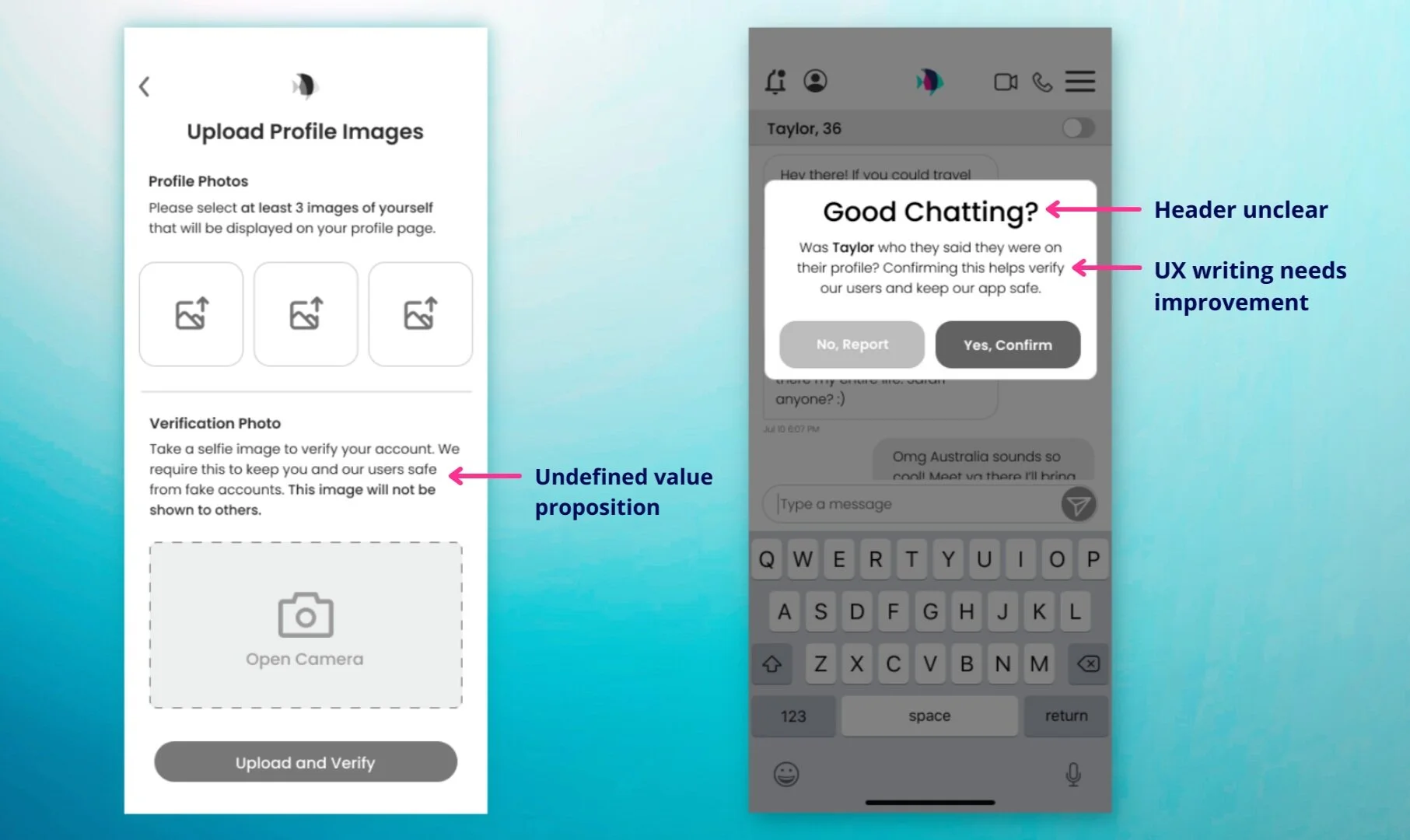
“Pain points centered around unclear value propositions and UX writing on call-outs.”

When asked about the message after the video call, 50% of users admitted that they clicked the confirm button assuming it was an ‘end call’ button. Users were not understanding the vague CTAs and simply clicked to dismiss the message.
The overlay message needed rewording to be more impactful and direct.
hi-fi color mockup
As a final deliverable, we created a color mockup that corrected these UX writing issues. By using clearer, universal wording, we refined the header call-outs and microcopy (i.e “Good Chatting?” became “Verify Taylorguy92”). We also added report options to the end screen, allowing users to select a specific reason. A final overlay gave users confirmation that their report had been submitted.

next steps
Improve overall transparency of personal data storage and security
Conduct more usability testing to observe how various demographics respond to verification features– especially with less tech-savvy users
A/B test more CTA wording to gauge quantitative effectiveness


