Natural Gardener
Timeline
2-week solo sprint
Spec project
My Role
UX Researcher
UX/UI Designer
Visual Designer
Tools Used
Figma + FigJam
Proven by Users
Adobe Illustrator
Deliverables
Competitive research
Information architecture
Interactive prototype
ABOUT

The Natural Gardener is a colorful garden center and nursery serving Austin, Texas since 1982. It’s a popular local favorite for its wide selection of organic gardening supplies, diverse plant life, and impressive themed gardens. Most of their customers are local and like to shop sustainably while supporting small businesses. During a 2-week sprint, I was tasked with redesigning their website for eCommerce integration.
THE challenge
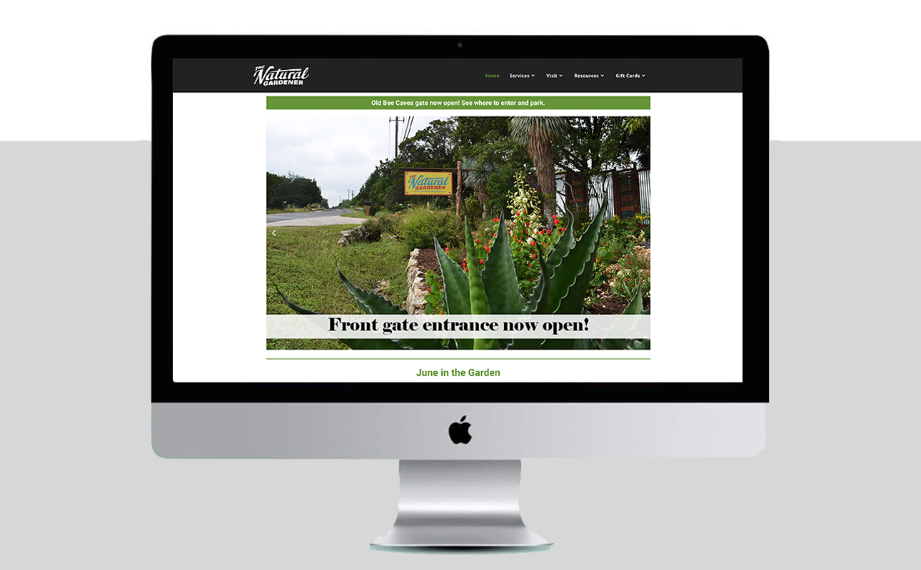
The Natural Gardener’s website had no eCommerce except for mailed gift cards. Their product lists had no images and were only included in the navigation as downloadable pdfs. The popular charm the garden center held in-store was missed within the digital space of their website. There was a massive opportunity to expand their reach to more communities while upholding their lively small store feel.
opportunities
“The site needed an updated design, improved information architecture, and ecommerce integration to compete in a rapidly-growing organic industry. ”
competitive analysis
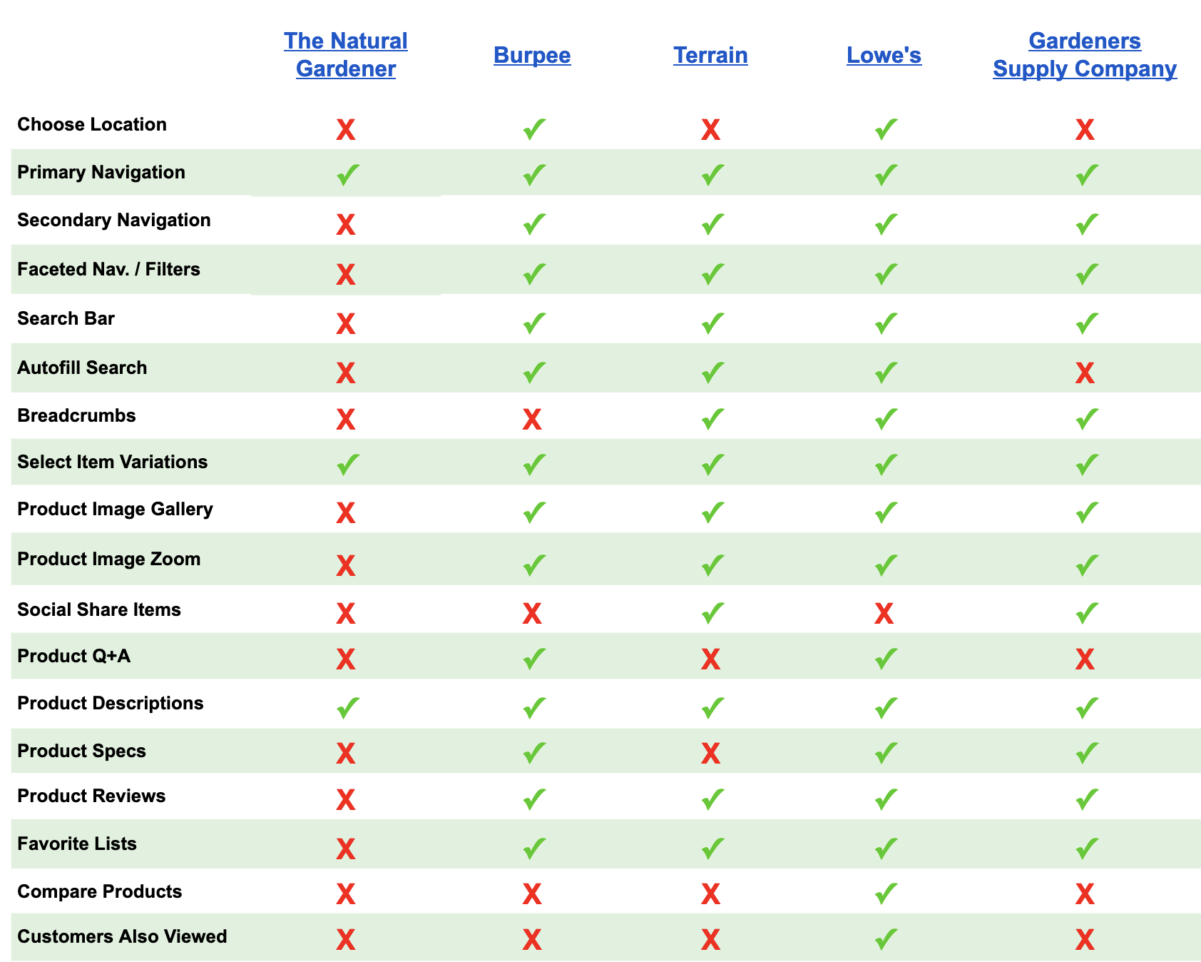
I began the discovery phase by auditing the website using usability heuristics to understand opportunities and pain points. Through competitive and comparative analysis, I learned what other industry websites implemented and what features were successful.
research insights
The website lacked thorough content– Such as shopping categories, information on organic gardening topics, item specifications, and store images or informative videos.
Competitors surpassed the Natural Gardener by offering better information design– Autofill search bar, primary and secondary shopping navigation, informative footers, detailed category, and product pages, and item comparison charts.
Competitors also offered customer product reviews– These contributed to the site’s shopping content and increased trust in the quality of products.
I collected customer reviews to establish the target user’s top priorities and frustrations. These insights led me to a user persona.
the user persona
User’s top priority: Quality
Takes a long time to make purchase decisions and reads product details
Compares multiple items before choosing which to purchase
Seeks out familiar brands and writes reviews
PROBLEM STATEMENT
How might we…
create a seamless shopping experience from the homepage to checkout?
give users helpful product info and reviews to assist with their purchase decisions?
connect users to a local community through the garden center’s online content?
Card sorting
Ten users completed card sorting using a set of fifty products from the garden center. Once a pattern of categories had emerged, I created two approaches to sitemaps to test the information architecture. The first focused on a primary and secondary shopping navigation with supplementary info in the footer. The second was more condensed and included dropdowns in services, garden tips, and upcoming events.
go with the flow
Based on A/B testing, I learned that a primary shopping navigation was easier for users to find products and meet their goals. The footer would house company info, events, returns, and other gardening content. I created a user flow to reveal the steps needed to complete tasks on the site.
sketching the solution
I experimented with possible ways users could interact with dropdown menus, category pages, filters, and footers. Mobile responsive layouts were also ideated as almost 50% of all U.S. purchases are now made on a smartphone. It was critical to have the website formatted for all screen sizes.
“73% of all ecommerce will be mobile commerce by the end of 2021.”
grayscale wireframes
Based on my sketches, I developed grayscale wireframes and a clickable prototype in Figma. I considered the following for the interface:
Speak to user needs: Highlight the brand’s unique qualities: 100% organic, local, charitable, and independently-owned
More interactive content: Less text-heavy, more imagery and engaging content on pages
USABILITY TESTING
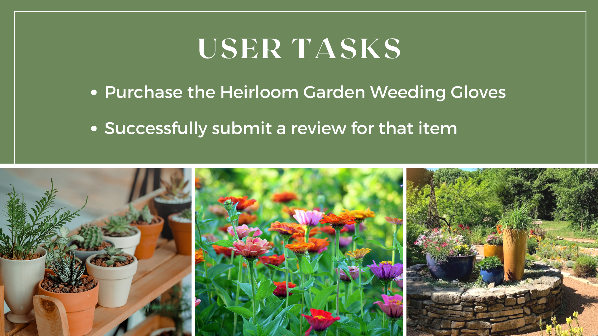
I completed remote usability testing via Zoom with six different users with two tasks. The goal was that each user would be able to complete both of these tasks in under 3 minutes with no errors.
testing results
All users successfully completed their tasks in under 2 mins with 1 error or less.
6/6 users first used the search bar to find the exact item the fastest way.
2/6 users tried to access their previous orders in order to leave a review. They didn’t want to search for the same item again as they felt it was redundant.
1/6 users struggled to return to the homepage. They didn’t understand the logo was clickable and instead looked in the header and footer for a button.
hi-fi mockup
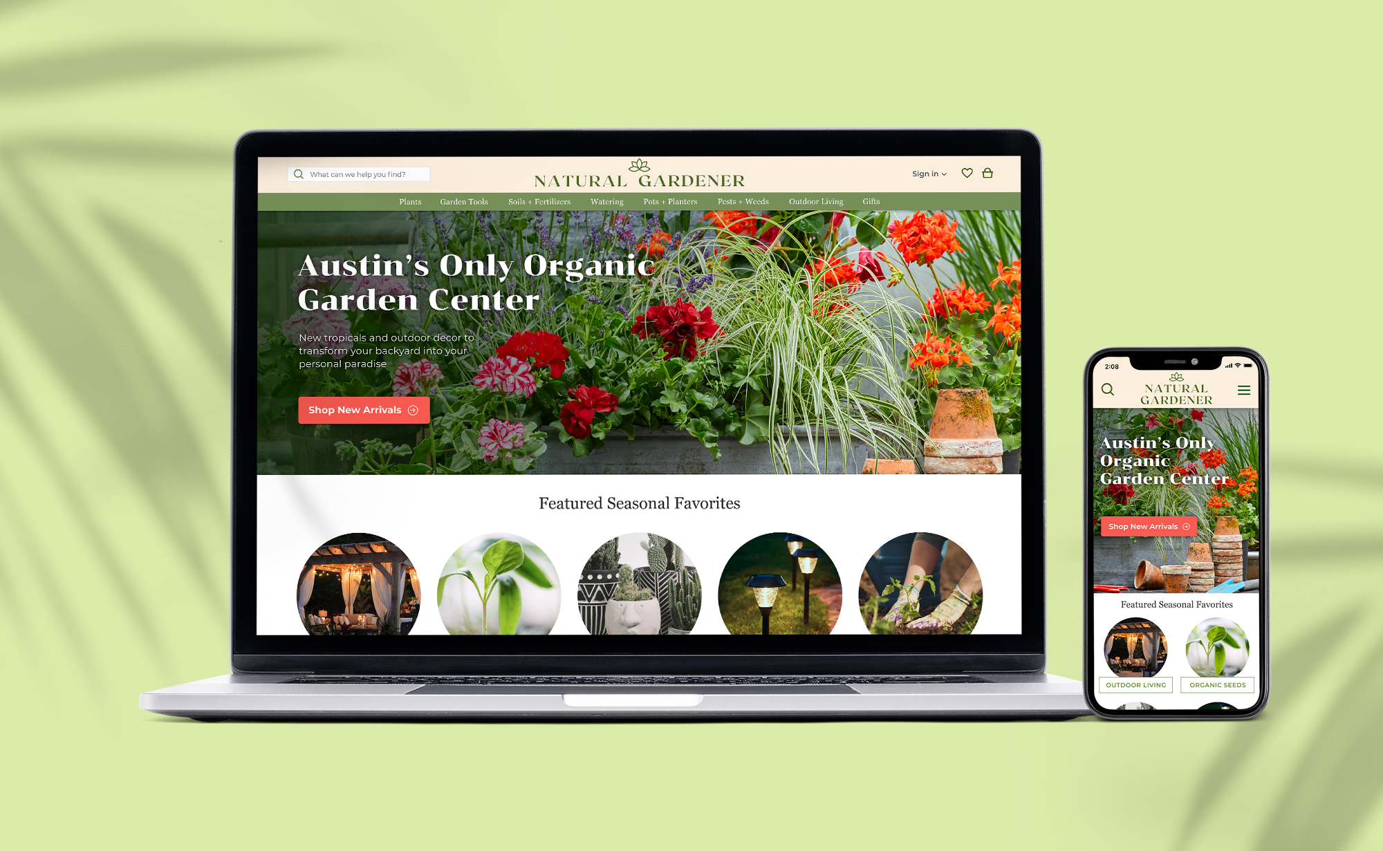
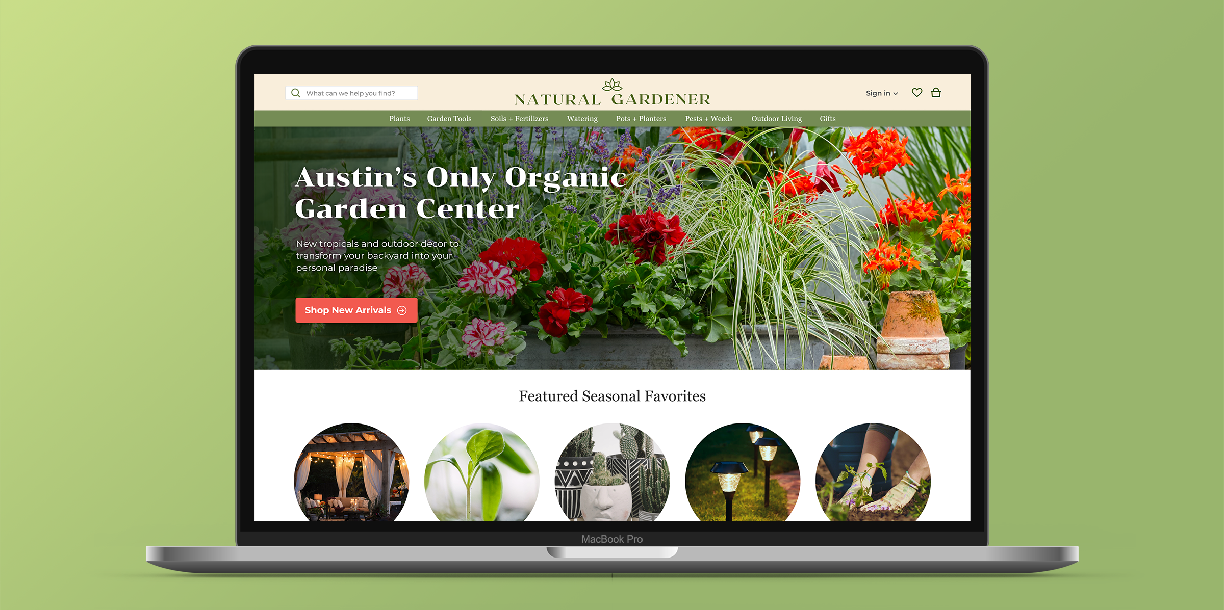
After initial testing, I built a full-color mockup that improved upon the discovered issues.
During the design phase, I updated the overall branding and created a new style guide to align with the target user. Warm colors, organic serif fonts, and natural elements connected the site back to the quality, local business.
Results
The final deliverable is an e-commerce website that not only looks visually appealing but also functions as an enjoyable shopping experience. It now caters directly to its customers’ needs of shopping sustainably while supporting a local business online.
next steps
Continue usability testing and improvements for seasonal events
Integrate more interactive elements into the shopping experience


